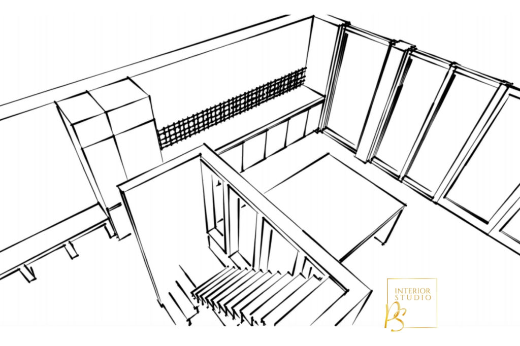
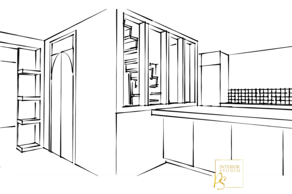
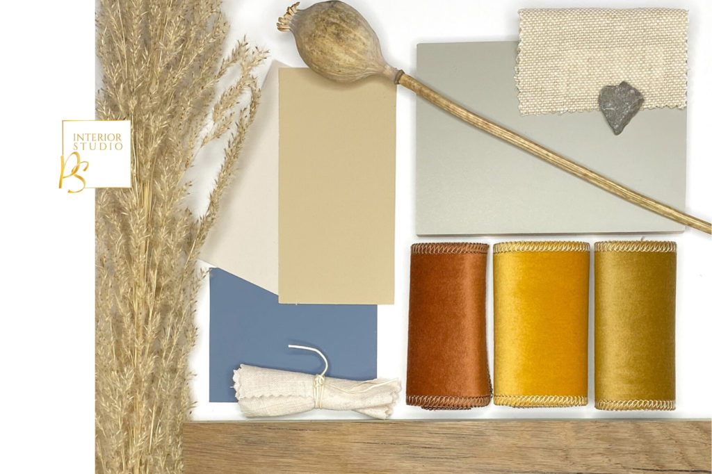
For this project I was asked to design a new layout for the ground floor for the new home of a family of four with two teenage boys that love to surf, skate and chill. An adventurous family that travels often and wanted the house to represent that. This new home should give an open and spacious feeling and function in that way as well. Next to the ideal layout it was important to advise on colours and materials, the wish was not to have any white walls in the house.
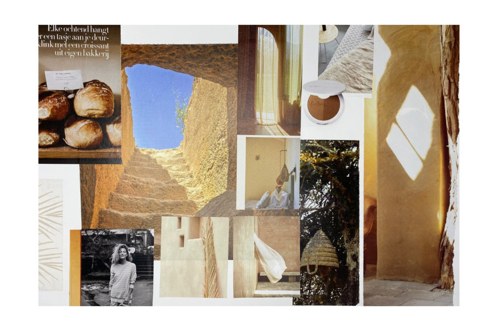
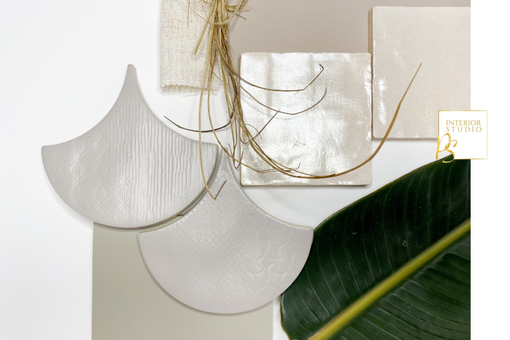
A home where Morocco meets Indonesia & Australia. A home where the open character attracts your attention straight away, a welcoming feeling where you easily connect with the people that live here. The materials and colours are warm, with texture, practical and surprising. A clean and calm look with enough space to highlight all treasures from travels. A home with several corners to sit down, to relax and connect with a group or alone. Large windows and doors to invite the natural light in the house and make the connection with the outdoors.
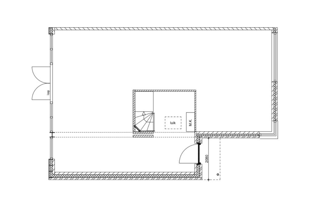
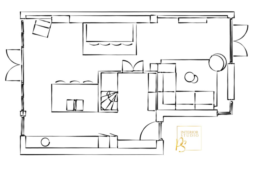
Before you start any interior project always first look at your layout, it’s an important starting point to make everything flow and feel right. For this family we started with a blank canvas, because the house was a new build. Important starting points were the wishes of the family: beautiful and practical, plenty of seating, clean look, international holiday feeling, connection with outdoor, spacious kitchen.
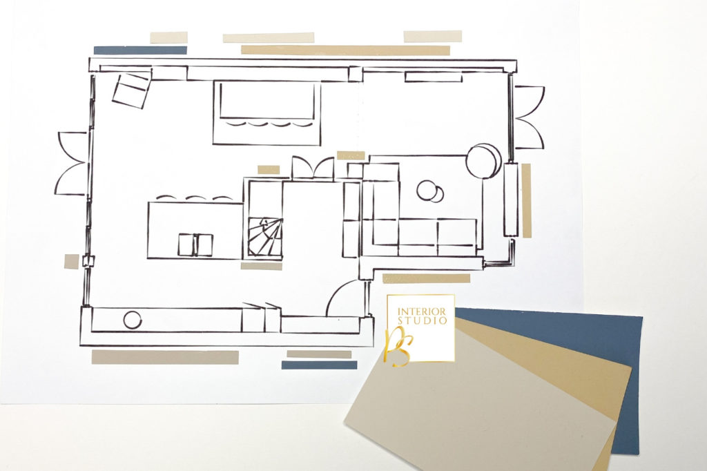
The wish was not to have any white walls in the house. For this advice the new layout is was my starting point to choose all different colours for the walls. The visual below shows you how the colours are divided. With choosing these colours I always keep the natural light in mind, because that can have a big effect on how you experience the colours in your home.
As you might have already noticed above in the new layout, I made some bigger changes by adding new windows and doors. I choose to do this to enhance the open character of the house and bring some surprising elements to make the house fit to the personalty of their owners. To give the new owners a better understanding of the look of these changes, we decided to translate two parts of the house into a 3D design.
